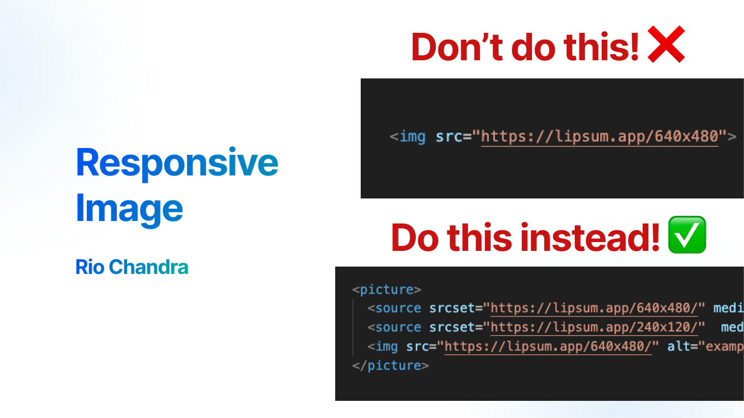
Using this code, the image shown will be “240×120” on screens smaller than 640, and “640×480” on larger screens”
I use this source code, it will show “240×120” if your screen is lower than 640, and show “640×480” bigger than it.
<picture>
  <source srcset="https://lipsum.app/640x480/" media="(min-width: 640px)"/>
  <source srcset="https://lipsum.app/240x120/"  />
  <img src="https://lipsum.app/640x480/" alt="example image" />
</picture>
Why Responsive Image?
Modern browser have feature to choose what image that will display, by doing this we can improve user experience
- Faster Load: User will get smaller size for smaller screen
- Responsive Image: Different orientation show different image
- Different Resolution: same size but different resolution
<picture> and source
Using picture and source is the original way to create responsive image. picture tag should have 0 or more source and 1 img tag. srcset used at <source> tag.
Use property media to make images responsive based on browser size.
<picture>
  <source srcset="https://lipsum.app/640x480/" media="(min-width: 1200px)"/>
  <source srcset="https://lipsum.app/640x480/" media="(min-width: 640px)"/>
  <source srcset="https://lipsum.app/240x120/"  />
  <img src="https://lipsum.app/640x480/" alt="example image" />
</picture>
Also source media element can also detect the browser’s orientation.
<picture>
  <source srcset="/media/portrait-image.jpg" media="(orientation: portrait)" />
  <img src="/media/default-iamge.jpg" alt="" />
</picture>
Using srcset followed by an x (such as 2x) enables serving a high-res image for high-DPI Screens, for example if user have 2 different monitor with different DPI Screens.
<picture>
  <source srcset="/media/400px.jpg 2x" />
  <img src="/media/200.jpg" alt="" />
</picture>
img tag also can write in single line srcset, add property sizes to add information which image will show in what conditions.
<img
  src="https://lipsum.app/640x480/"
  alt="example image"
  srcset="
    https://lipsum.app/240x120/ 240w,
    https://lipsum.app/640x480/ 640w,
    https://lipsum.app/1280x960/ 1280w
  "
  sizes="(max-width: 640px) 240px, (min-width: 641px) and (max-width: 1280px) 640px, 1280px"
/>
When should you use this?
Landing Page, Landing page is the most page that user will visit when they open your sites. By doing this, you will improve user experience whenever visit your sites.
Header Image: Typically, header images such as hero section or logo are the most visible elements for users. The goal is to highlight the areas of the site that users see most often.
Not every scenario calls for responsive images, as they require more storage to accommodate various iamge sizes. For example, list of posts page usually shown many thumbnail blog, if you have 100 blogs and each thumbnail have 3 size of images, you will get 300 thumbnail images. Capacity storage should be consideration if you want to implement responsive image in all page of your site.
Reference
If you want to read more about picture tag, read article : The Picture element By Mozilla and Responsive images By Mozilla.
Conclusion
Responsive image in web browser is a handy feature, deliver the right image to the right audience could improve user experience, performance, and user attention. Tag picture and property srcset really help us as developer to create beautifull website with ease. If you found this article usefull, join my channel The IO Hub for more update in this small blog!


