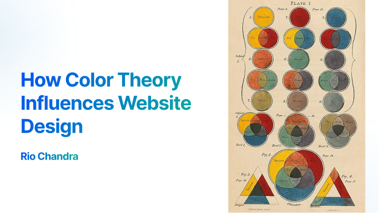
Landing page is the first page user see. I was wondering how to create beautiful color, shape and how it’s affect intention of creator. My curiosity become larger when I read about Color Theory.
Color theory isn’t new theory, it has been researched since year 800-ish. I was wondering how it’s affect website looks. So, I openned up figma to create simple landing page. Below is my first design of landing page.

I don’t want waste my time to experiment color theory, find the right one. But my intention is just experimenting the color theory into this design.
Thanks to these websites:
I choose random color from winter gallery, after spend some times to put color in and randomly change the font based of fontjoy recommendation. It looks good, just like name of color gallery “winter”. The blue and it’s Complementary make it warmer.

I tried another example of color, let see if it affect how the website looks.
Here is my second attempt and using sunset palettes, it’s warmer and cozy. Just like the palettes names. I love this little change makes website more alive. User will understand the intention of creator website with the right color combination. This combination makes it spark creativity and brave.

Let’s add some element, I put some firefox browser image—for educational purposes— just to make it alive and send the message to user. I thinks this is good and better than plain text.

Why do we stop here? let’s try another color combination. I tried Cold palettes for common business solution. It’s professional and trust-worthy.
I try some combination of first section landing page, As we can see bold background blue make it heavier in visual, it able grab attention instead plain background, but it’s not a neccesary.

Another example are using Radial Gradient from top left to bottom right. I want user’s eye move from top left to bottom right, follow the path of information. By doing this, the page become more dynamic.

I just learn these color makes harmony and speak the attention of author.
Color theory is simple, I’ll explain in simple term:
- Primary Color: Red/Green/Blue(RGB). Choose one!. Blue is professional, cold and friendly. Red is energic, idea, and fire. Green is earthy, plant, community.
- Secondary Color: Choose color between RGB—Mixed color. Yellow is combination green and red. Cyan is combination of green and blue. Purple is combination of red and blue.
Good Combination of primary and secondary colors will makes the harmony. Here is some combinations color:
- Complementary— Opposite sides of the color wheel. Cyan—Red, Yellow–Blue, –Purple–Green.
- Monochromatic—Combination of shades, tones and tints from base color.
- Analogous—three colors that are side by side.
- Triadic—Three colors evenly spaced, this will makes contrast color.
- Tetradic—Four colors evenly spaced, makes the color bold and strong.
I know, it’s hard to imagine those combination color, I recommend you to visit these palette generator or library that I found in internet to help you imagine and feel the harmony
- Canva Color Wheel—Color wheel from canva
- Colorhunt—Library palette
- Paletton—Complex color wheel
The harmony and colors should align with the individual or organization’s intention. To achieve this you should learn to empatize to others.
My last attempt is to create real usecase, I take example from my wife business—meowmade, a handmade crochet.

This is a product landing page, it should show information of product, Call-To-Action (CTA) in any section, and products listing. I choose color green-earthy to match with images color—I learned that image’s color also affect the color of website— to create harmony.
I believe when add some element like payment method, cheap price and product preview will able create attention and quick understanding about the whole business. I add dot patern to match crochet texture, also I think it become more dynamic and easy to follow with eye.
Bold background color in produk terlaris (Best-selling product) will grap user attention too, it’s like banner in front of home.
The more I add element and image, the more I learned. Images of product should transparent to make user only focus on product. I ask gemini to remove the background.

I add more section in this page to educate the user.
- Reviews Section—Other people word is more trusted
- How to Order Section—Just a quick reminder about how easy to order
- Whatsapp Button—Not all people love to do purchase in online website, whatsapp is alternative channel to create payment and connect to customer
- Social media Section—Social media is more updated and live, making users more engaged with the product.
I felt pleasure with this design, layout and colors. Many years I code html, css and js but I never seen website in this perspective. It’s like a whole new world to me, learning to appreciate aesthetics.
I just learn a lot from this use case, I ask more to my self. What is landing page? is there any pattern? is there any common layout? But I will learn this next time.
I think landing page is more than a page of HTML, CSS and JS but it’s a channel communication. I’m as Web Developer should learn more about visual and intention of people, increase empatize and understanding people. I think this will made developer going to higher level of dimention. Eventually it’s not about code, color, or layout but it’s about people.
I hope you gain some insight from this. Thank you for taking the time to read it!