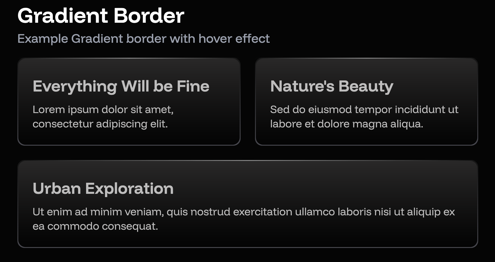
Border in css is boring just because can’t be gradient. Developer do much thing to make it not boring, codyhouse, digitalocean and community dev. But it have trade-off, the border can’t be rounded.
Border gradient is modern design when comes to web design, sometimes it mimic how glass works. Let see how we re-create this using css—tailwindcss.

–Before we start, I’m using tailwindcss version 4.1.11
First of all, we have to create the container. Highlighted code act as border gradient and the children SHOULD have color background to block parent background color and padding 1px, and now you have a effect of border.
<div class="relative  shadow-lg group delay-100 transition-all duration-300">
  <div class="relative p-[1px] rounded-lg  from-[#151515] to-[#48484f] bg-gradient-to-b">
    <div class="bg-gradient-to-b from-[#292828] to-[#040404] p-4 rounded-lg text-[#bfbebe]">
      <!-- Content here -->
    </div>
  </div>
</div>Add any content you like at <!-- Content here -->. here is example full content
<div class="relative  shadow-lg group delay-100 transition-all duration-300">
  <div class="relative p-[1px] rounded-lg  from-[#151515] to-[#48484f] bg-gradient-to-b">
    <div class="bg-gradient-to-b from-[#292828] to-[#040404] p-4 rounded-lg text-[#bfbebe]">
      <div class="flex items-center justify-end h-full relative">
        <div class='space-y-1'>
          <h2 class='text-lg font-semibold '>
            {title}
          </h2>
          <p class='font-thin text-xs '>
            {description}
          </p>
        </div>

      </div>
    </div>
  </div>
</div>Next thing is, how I create glass-light-effect at top of bar?. Since we have relative position, we can create absolute component to the top of border. Add this line at the bottom of container.
<div class="absolute top-0 left-0 h-[1px] w-full bg-gradient-to-r from-transparent ease-linear via-white/50 to-transparent group-hover:scale-x-50 transition-all"></div>Here is the full code.
<div class="relative  shadow-lg group delay-100 transition-all duration-300">
  <div class="relative p-[1px] rounded-lg  from-[#151515] to-[#48484f] bg-gradient-to-b">
    <div class="bg-gradient-to-b from-[#292828] to-[#040404] p-4 rounded-lg text-[#bfbebe]">
      <div class="flex items-center justify-end h-full relative">
        <div class='space-y-1'>
          <h2 class='text-lg font-semibold '>
            {title}
          </h2>
          <p class='font-thin text-xs '>
            {description}
          </p>
        </div>

      </div>
    </div>
  </div>
  <div class="absolute top-0 left-0 h-[1px] w-full bg-gradient-to-r from-transparent ease-linear via-white/50 to-transparent group-hover:scale-x-50 transition-all"></div>
</div>This method have trade-off too, this card can’t be transparent and it should have colour. But overall it make your website cooler.
Give a follow or subscribe to get my latest post! Thank for your reading!.